
At its center, The Grand Budapest Hotel (2014) is a tale of days gone by, an era that has passed us. It is enjoyable because it is a glimpse into a stylized snapshot, potent with nostalgia and quirky eccentricity, a phrase I’m sure has been used to describe Wes Anderson’s films since Bottle Rocket.
But what makes this film in particular so enjoyable to watch? When it comes to narrative technique, composition, and dialogue, it really hits the sweet spot, but what interested me most was the symmetrical composition, which I’m about to dive right on into.
Composition: Color Scheme
One of the key hallmarks of any Wes Anderson film is his attention to symmetry; as previously discussed here, symmetry makes us feel psychologically certain of an uncertain reality – it gives balance to an immediate experience which allows us to make sense of what we are seeing. Symmetry is also aesthetically pleasing, and Anderson works wonderfully with a set palette.
When we are first introduced to the hotel, it is 1968, far after its heyday; it is a Soviet relic, concrete, with the dulled monochromatics of the 1970’s: burnt orange, brown, mustard yellow. The autumnal color palette of the 70’s is a whole other topic in itself, a backlash to the psychedelic, electric colors of the swinging 60’s and very much a reaction to the society of its time – a world mired in war, unstable political spheres, and subterfuge.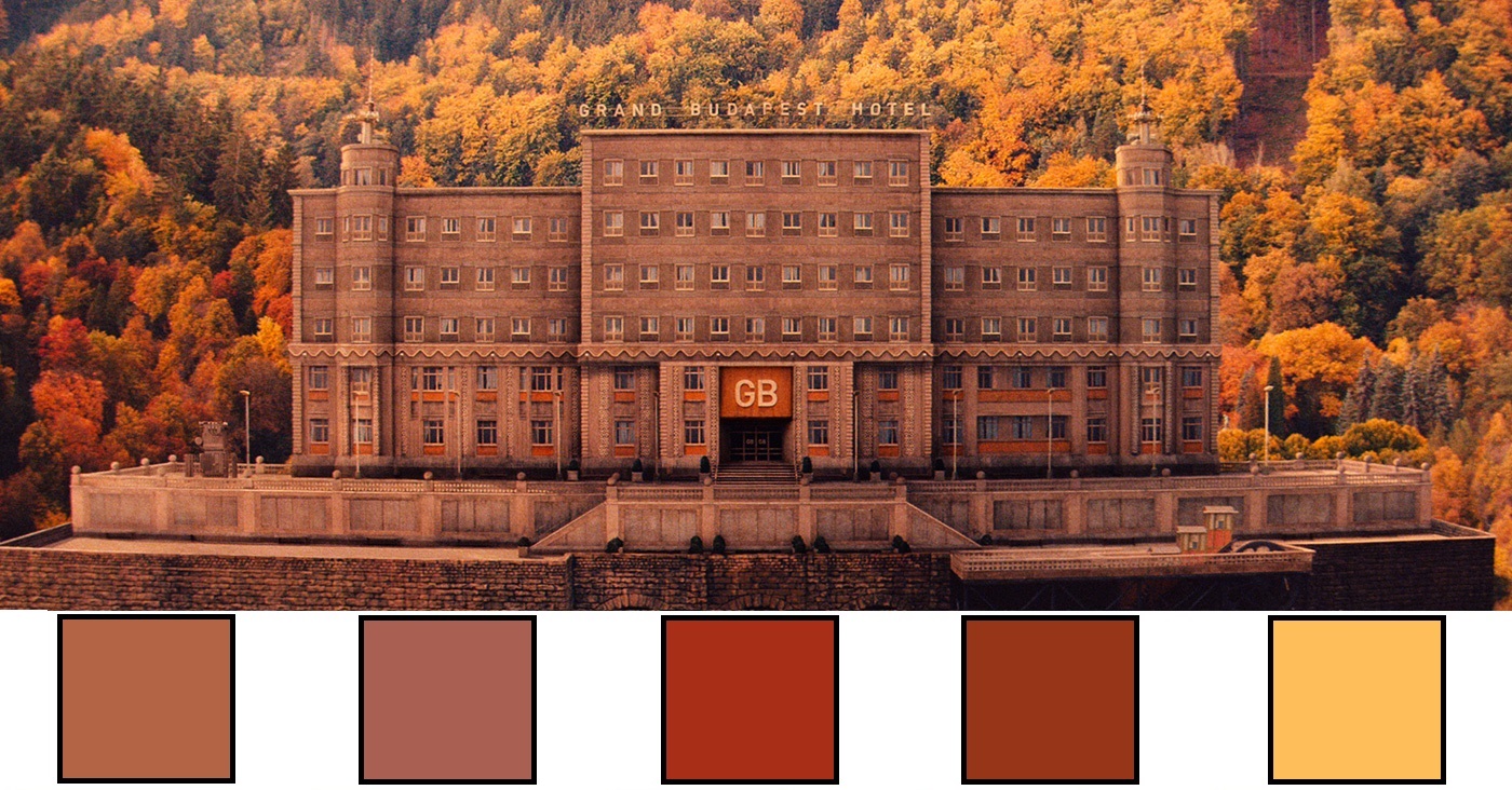
The interior of the hotel has changed as well, as fashion trends shift and new management changed hands, and despite Mustafa owning the building throughout, he most likely was a distant if not benevolent investor, too busy jetsetting or traveling on business ventures to care about the design changes. The palette is consistent with the exterior, the same uninspired adherence to the latest fashion dictum, adding another symmetrical element and continuing the theme of a once-great institute’s slide into mediocrity.
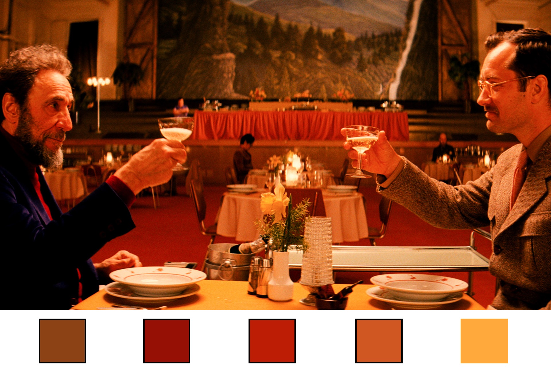
On the other end, when we see the hotel in its prime, it is delightful. There is clear care and attention to detail in its presentation, ostensibly by M. Gustaf but of course in reality by M. Anderson. The hotel has been described as ‘a Faberge egg’, and a ‘candy-colored Middle-Europe Bohemian Theme Park’ – what contributed to these specific descriptions? The splendor of the hotel is meant to be a throwback to the early 20th century dregs of imperial luxury, an intricate, finely-made stone before it is skipped across Europe and through two devastating world wars. Loosely based on the writings of Stefan Zweig, a Viennese writer, and more specifically on his book “The World of Yesterday” (although his biography of Marie Antoinette is none too shabby either). Zweig writes somewhat nostalgically of the last days of empires before they fall to the new century, and their shifting influence on the people in them and operating within them, and this influence is layered over the film, right down to the Grand Budapest itself.
Nostalgia can often be likened to viewing at something with rose-colored glasses on. With Anderson, it is a little more literal.

This is a specific, continuous palette choice; everything is doused in creams, light pinks, deep purples, sumptuous red. It all looks like a Viennese pastry, bursting at the gills with buttercream, glazed in pastels, waiting to be topped with a cherry – an incredibly delectable piece montée. It looks so good, you want to eat it.
In addition, one of the main protagonists is a baker, working meticulously to make beautiful, towering confectionaries, ones that happen to match the exact scheme of the Grand Budapest. The staff of the hotel are always in the same royal purple, the lawyer, Kovacs (Jeff Goldblum) is always in dark grey, Agatha (Saoirse Ronan) dresses in cream with blue accents and occasionally pastels, coincidentally matching the confections that she creates; this film is symmetrical to its core.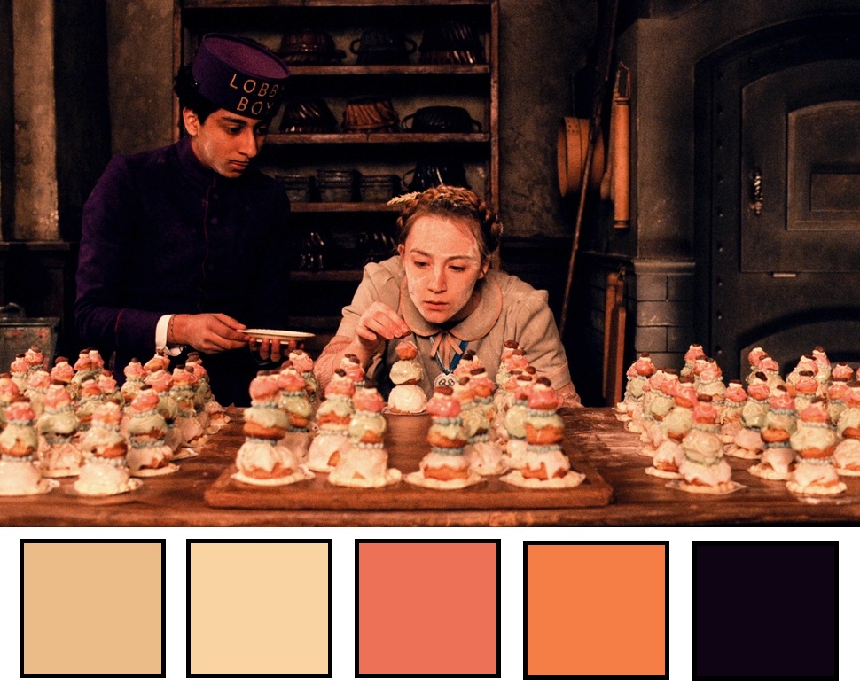
Speaking of symmetry:
Composition: Shots and Framing
Look at this for a moment – do you see how satisfying it feels?
When we view art, our eyes generally follow a specific layout, and we are naturally geared to spot patterns and follow them. We look for open spaces to defined the filled ones against and, unsurprisingly, we look for symmetry.
I believe Wes Anderson uses the rules of three in most of his frame composition, but most certainly in this film: if we split this shot into three, we can break down why it is so mentally comforting to look at. First let’s see it split into thirds vertically:
The center of this shot is open, giving us a relatively blank mental space for our eye to wander; it’s a curtained window, plain white, about as plain as you can make something. We are guided to the left by the handbag, which ends perfectly right before the doorway, and we continue on to Zero, bookending the shot. If we look to the right through the blank space, the shot is framed by M. Gustaf’s hand, as well as the bottle of champagne, and ends with the man himself. Satisfyingly symmetrical on that end.
Let’s look at its split horizontally: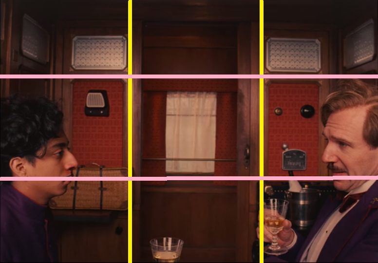
Our window and curtain there are still our ‘free space’, allowing the eye to wander where it will. We look up, and we see the doorway framed by two panels, perfectly aligned. In the middle, Zero and Gustav are almost parallel to each other, so much so that you could draw an almost straight line from nose to nose. Below is mostly filled with their lower body and torso.
This shot is just one of thousands of examples in Anderson’s works; he has an amazing eye and attention for detail. Let’s continue:

Obviously, at center in this scene is Dmitri (Adrian Brody), because he is the character speaking in the shot and therefore the focus point. Once again, the symmetry of color continues in the costuming choices, as all five characters present are mostly, if not exclusively, seen in all black throughout the film, a sinister color for sinister villains.
Let’s split the shot up the same way as before:
Dmitri takes up the central panel, giving us enough solid color and taking up enough of the foreground focus to leave the background readily available. His sisters clump together into the first third, and his henchman, J.G. Joplin (Willem Dafoe) takes up residence in the very back at the far end of the third section. Both sides serve much the same purpose as above, to act as frames for the shot.
Let’s see it horizontally:
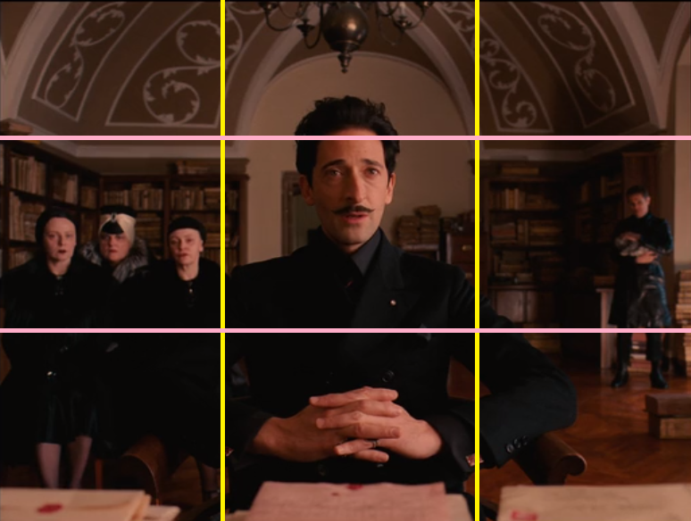 The top is left open, but symmetrical, again much the same as the scene above. The central focus is still Dmitri, but because the sisters are packed like sardines into the left panel, Joplin on the other end is at the far side to allow for the negative space. If he were closer in the frame, it would clog the depth perception and make the viewer feel claustrophobic; it is also is fitting with both sets of characters: the sisters, massed together like a tumorous cell, and Joplin, always watching and waiting, biding his time.
Finally, as my last note on the rule of thirds in the film, let’s see a scene where there’s only one character, and how Anderson works both in frame composition and characterization through set work:
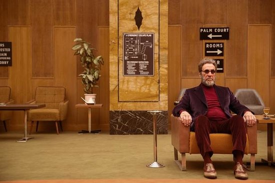
M. Mustafa, the enigmatic owner of the hotel, sits alone. Once known as Zero, and hired during the hotel’s glory days, he is now an old man, alone and lonely (yes, the two are different). He has no partner, no children, no protege, and a hotel crumbling to time that he sees as a reliquary of nostalgia and memory.

The center is clear, save for a map of the hotel and the potted plant. To the left, the chairs are so milquetoast as decor that they practically blend in with the walls. To the right is M. Mustafa himself, sitting glibly. The relative emptiness of this particular shot tells us of his isolation and establishes him as a solitary man, neither engaging with his guests or hiding unseen in his room, but simply and sorrowfully there.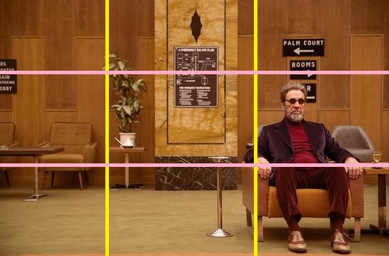
Again, we have a blank centerpiece, framed on either side by prop and actor. The upper portion is unremarkable save for the signs above Mustafa’s head, breaking up the monotony and leading our eye down to the focus of the shot. The bottom and the blank carpet also makes us travel to where the action is, if only to get away from that beige. In this frame, where does our eye go but straight to Mustafa, making us as curious as the Author is about his identity. Who is this man wearing a splash of red in a sea of carby beige?
Anderson is in full symmetric fashion in this film. I think that going forward I’ll probably wean off plot commentary and head more towards focusing on the technical aspects of the film of the day, its composition, the cinematography, the color choice, etc. Overall, The Grand Budapest is truly a delight to watch, but as much as I enjoy the why of it, now I want to get to the how, mainly how directors and cinematographers produce the ambiance and atmosphere of the films they create.
